Rethinking Sustainable & Effective Service Delivery at Affordable Housing
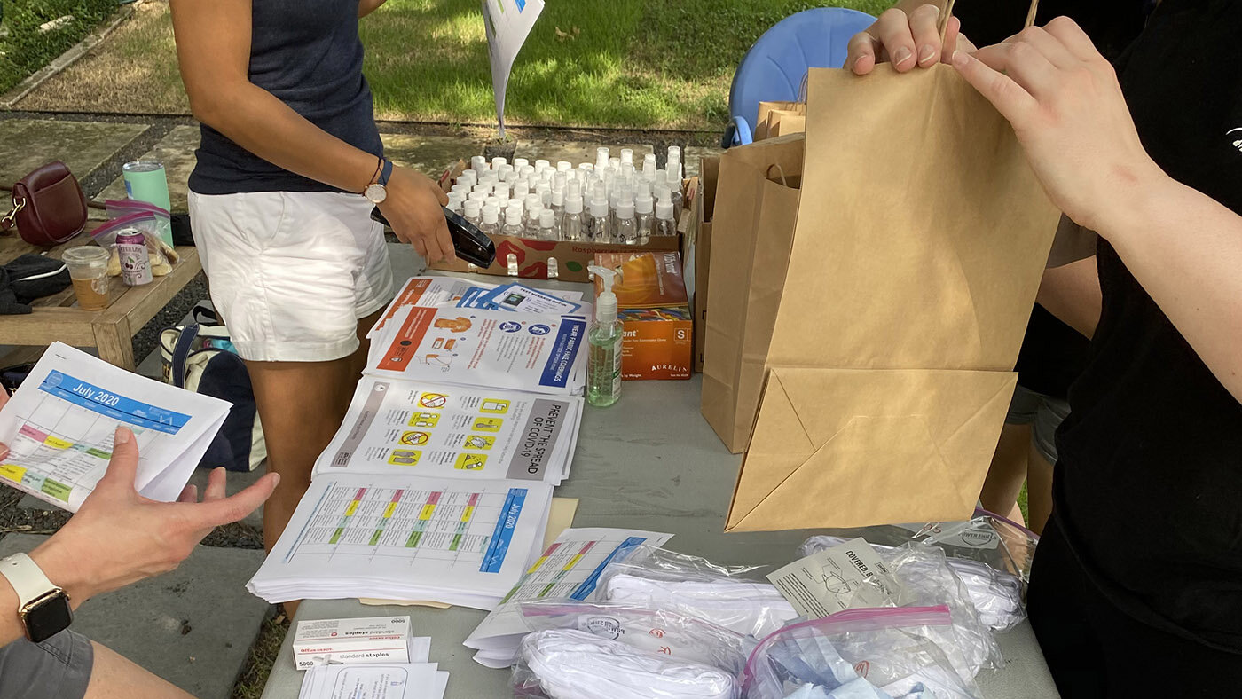
Creating COVID-19 packages in response to resident need
How might we redesign service delivery at an affordable housing complex to serve resident’s needs within a system that has no incentive to do so?
PROJECT DETAILS
Date: 2019 - Present
Project Background: After getting a grant from the St. David’s foundation in collaboration with the Steve Hicks School of Social Work, our goal was to learn the needs of the residents and help provide services that could positively impact their health and wellbeing (social determinants of health).
Design: Service Design, Visual Design, Design Research
Constraints & Challenges: sustainability when grant money ends, material cost and labor, systemic structures that make needs of residents more complex and ever-changing, no buy-in from management, built rapport with residents, create visual look and feel that is simple and easy enough for any non-designer to manage, measuring social return on investment, resident tech literacy, and we were not introduced to the complex - we had to go in with no current relationship to the residents.
Team:
Diana Siebenaler (Director of Partnerships, primary research & synthesis)
Rose Lewis (Social Worker & Social Service Designer, primary research & synthesis)
Diana Gonzalez (Interaction & Service Designer, research synthesis)
Natalie Campbell (Service & Communication Designer, research synthesis, intern manager)
Metinee Ding (visual design intern, led by Natalie Campbell)
Press:
- We presented this project during Austin Design Week, 2020. See my blog post, or the event page where you can watch the recording of the panel
- School of Design and Creative Technologies, College of Fine Arts
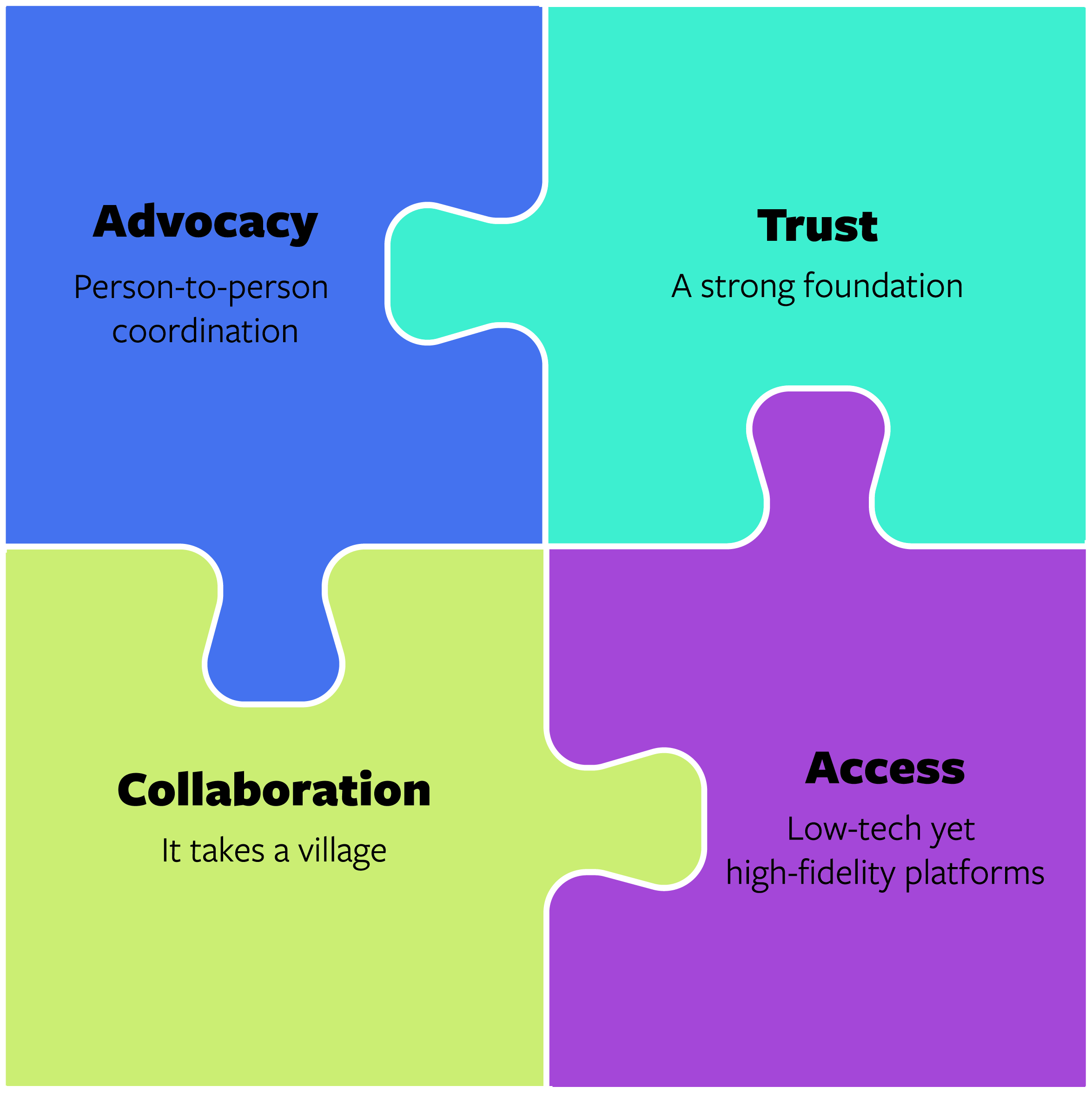
By using service design as the tool, and social work methodologies, we have been able to bring sustainable services that meet the ever-changing needs of residents at the complex.
Prior to COVID-19, we brought services in-person. Since COVID-19, we have adapted those services to be remote, while also addressing the urgent needs from the residents like needing masks, hand sanitizer, and other PPE.
Creating the Service Delivery
Service Blueprint
Business model: how can we create one that is sustainable and is able to be replicated to other affordable housing complexes in Austin?
Measuring Social Return on Investment based off of qualitative interventions in a quantitative environment
Our blueprint is more complex than a typical service blueprint. This is because we plan on creating a service manual based off of what we have learned, so that other people that want to create a model like ours can do so through our Service Manual, which is on pause because of COVID. What we do have is our service blueprint, with a few layers added in: nudging for behavior change, measure & evaluation of Social Return on Investment (SROI), and our learnings/warnings etc. that would be good to know for anyone who wants to replicate this model.
Service Design Manual
On pause as of 3/2020 from covid-19
Process and Context
RESEARCH AND HISTORICAL CONTEXT
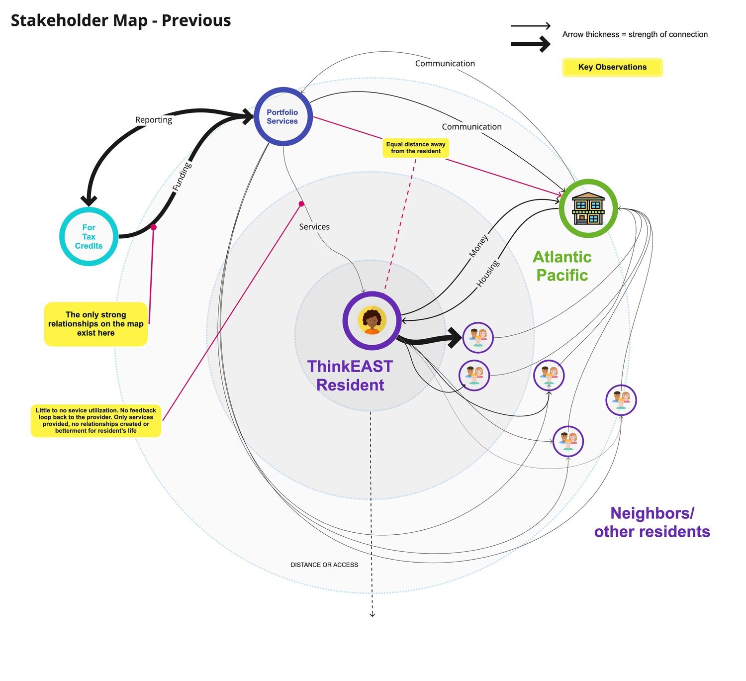
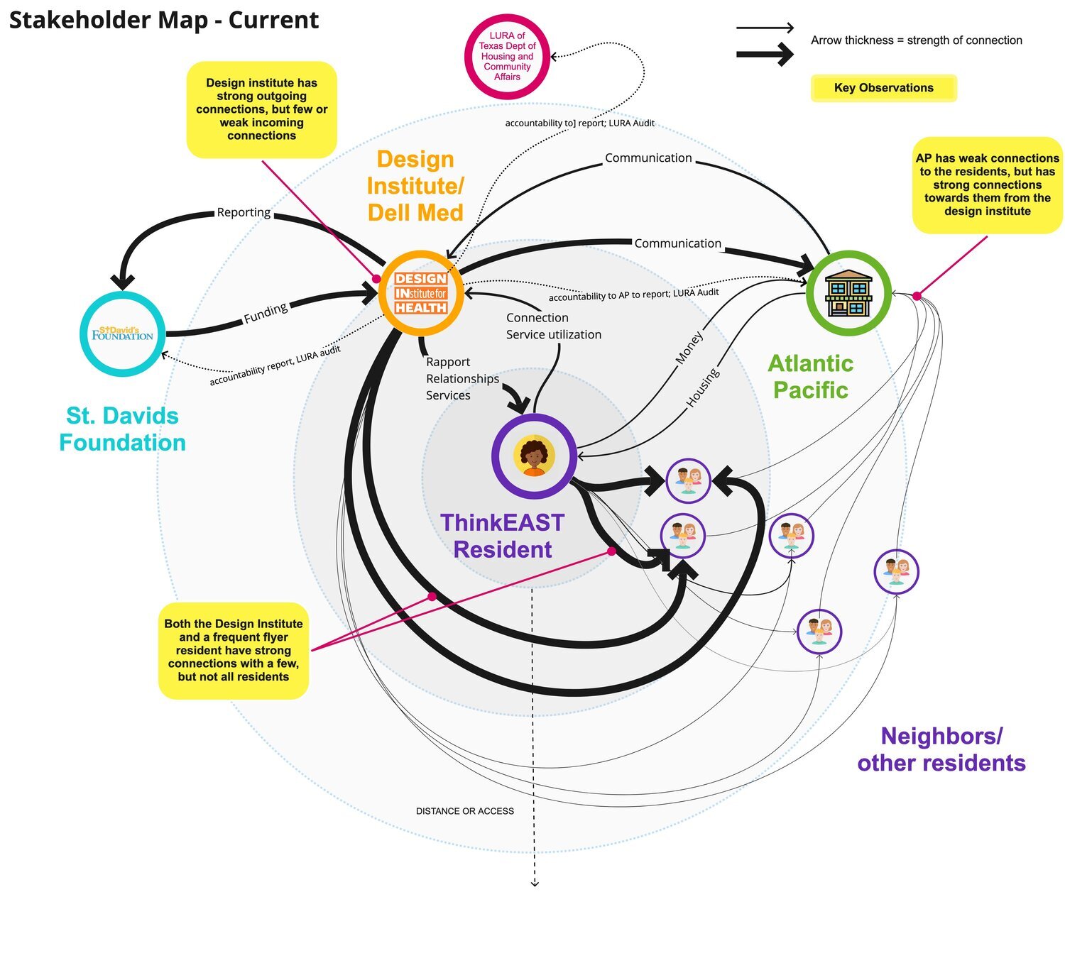
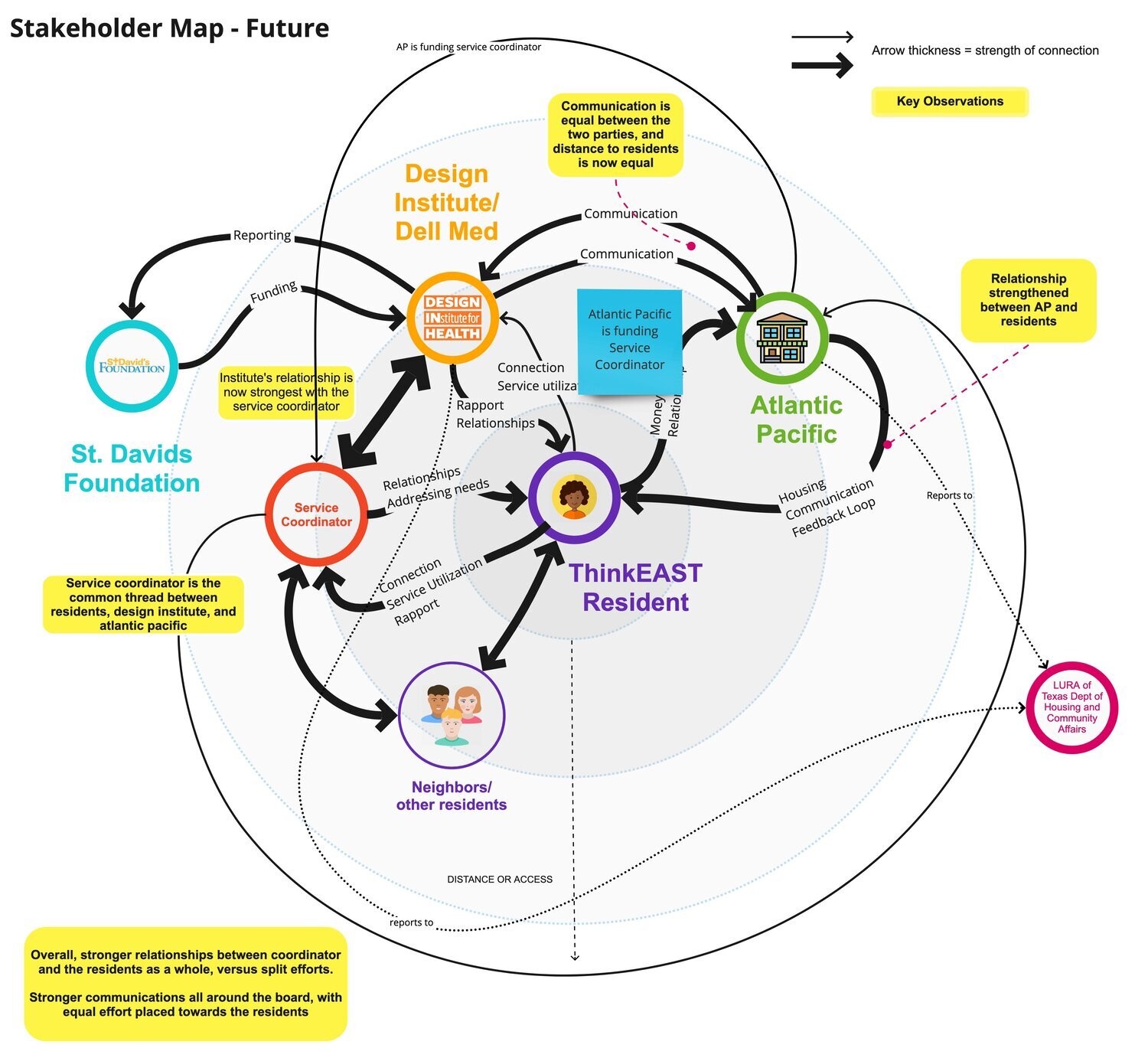
After the first half of the team conducted primary research with residents at the apartment complex, we had a co-design working session with the residents to validate what we heard. All of the stakeholders in this project have different relationships with the residents, and have different interests and goals. The residents themselves didn’t ask for us to be there, so building rapport and providing services they wanted and needed, not what we thought they’d want or need, was super important, especially in the historical context of East Austin and the University.
Typically, those who have the resources and knowledge to design things have power and privilege, and we have recognized our position here. We want to give that power back to the residents. We have also acknowledged the poor history of the University of Texas and conducting research on the east side of Austin, TX. We approach this project as outsiders, not assuming we know what the residents need (which is what the previous service coordinator did before us), with the residents being the experts of their own lives.
One of the most important parts of this project is sustainability. During our co-working session, a resident asked, “You’re not going to just get up and leave us, right?” because that is the environment and expectations in this space. There’s no use of providing services if they can’t be sustained to create change over time. That is when we brought in our social worker to build rapport with the residents.
CHOICES FOR (LITTLE) VISUAL DESIGN
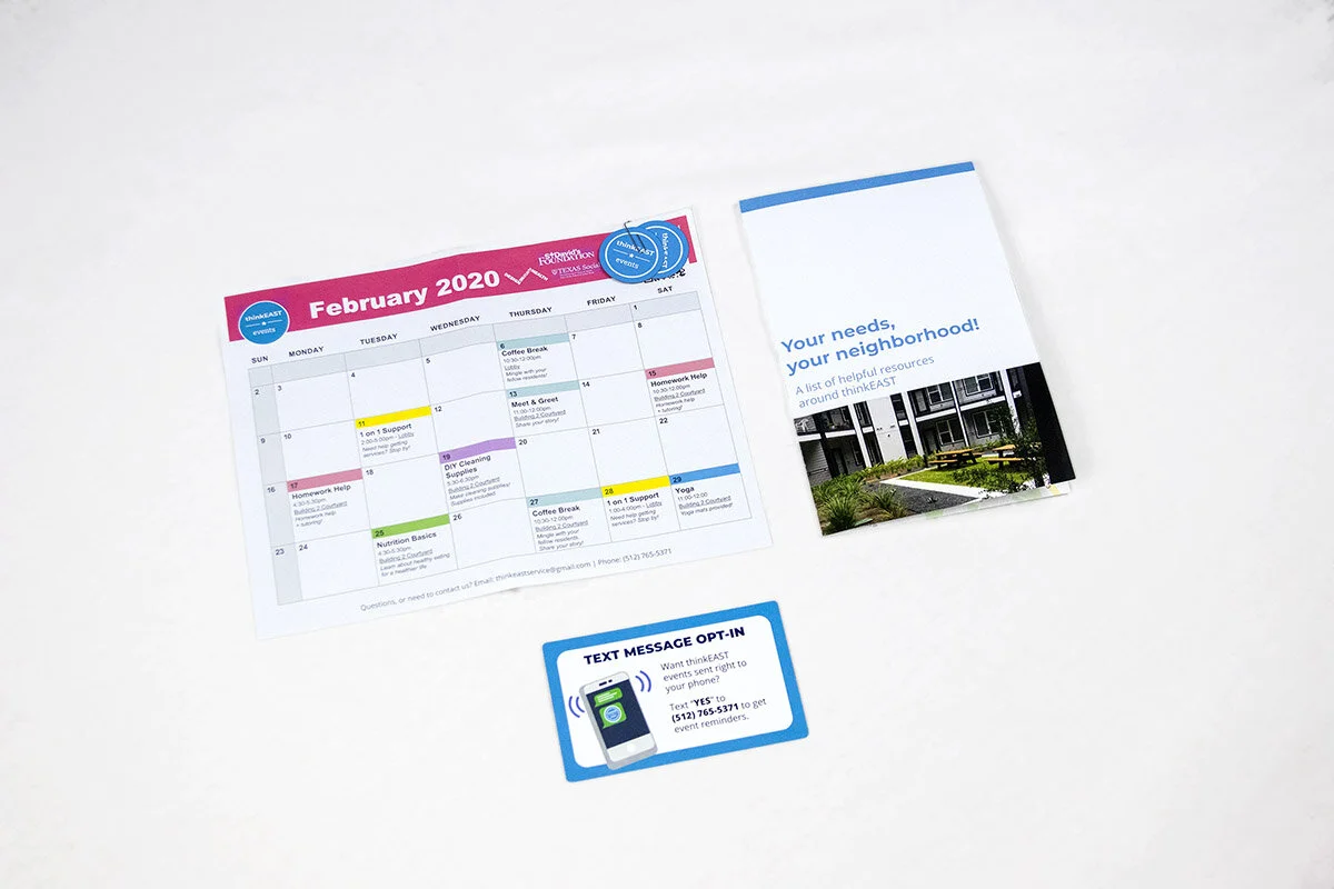
Another thing with sustainability comes the ease production of communication materials. Ideally, I would have created a beautiful visual identity and spent time and care into it. But with us needing to prototype and test services quickly, and knowing that these materials would need to be passed onto a non-designer, I chose to go with one to two main colors, typography that is used from Google Fonts or already downloaded into most operating systems, and created all materials in Microsoft Word, Powerpoint, and Excel. It was more important for us to communicate information effectively and quickly to the residents, rather than creating something absolutely beautiful. The simplicity of the visuals also comes off as less “official” and more causal/approachable, which we believe was used in our favor.
COVID-19 AND CHANGING RESIDENTS’ NEEDS
With COVID-19, the needs of the residents changed. Because of those relationships we had built in the months prior, we were able to address those needs sufficiently and quickly.
Stakeholder System Maps
Measuring Social Return on Investment
Since this project involved grant work, we worked to meet the quantitative needs that were required. Obviously, we were also interested in measuring the qualitative data we discovered through service implementation to see if our interventions were of value to the residents. I independently initiated researching Social Return on Investment (SROI) and how that could be used as a tool not only for this engagement, but for the entire studio, since not everything we create can be measured by numbers alone. Since the terminology and descriptions within the report were complicated, I used my visual design skills to visually communicate the frameworks that the original report was writing about.
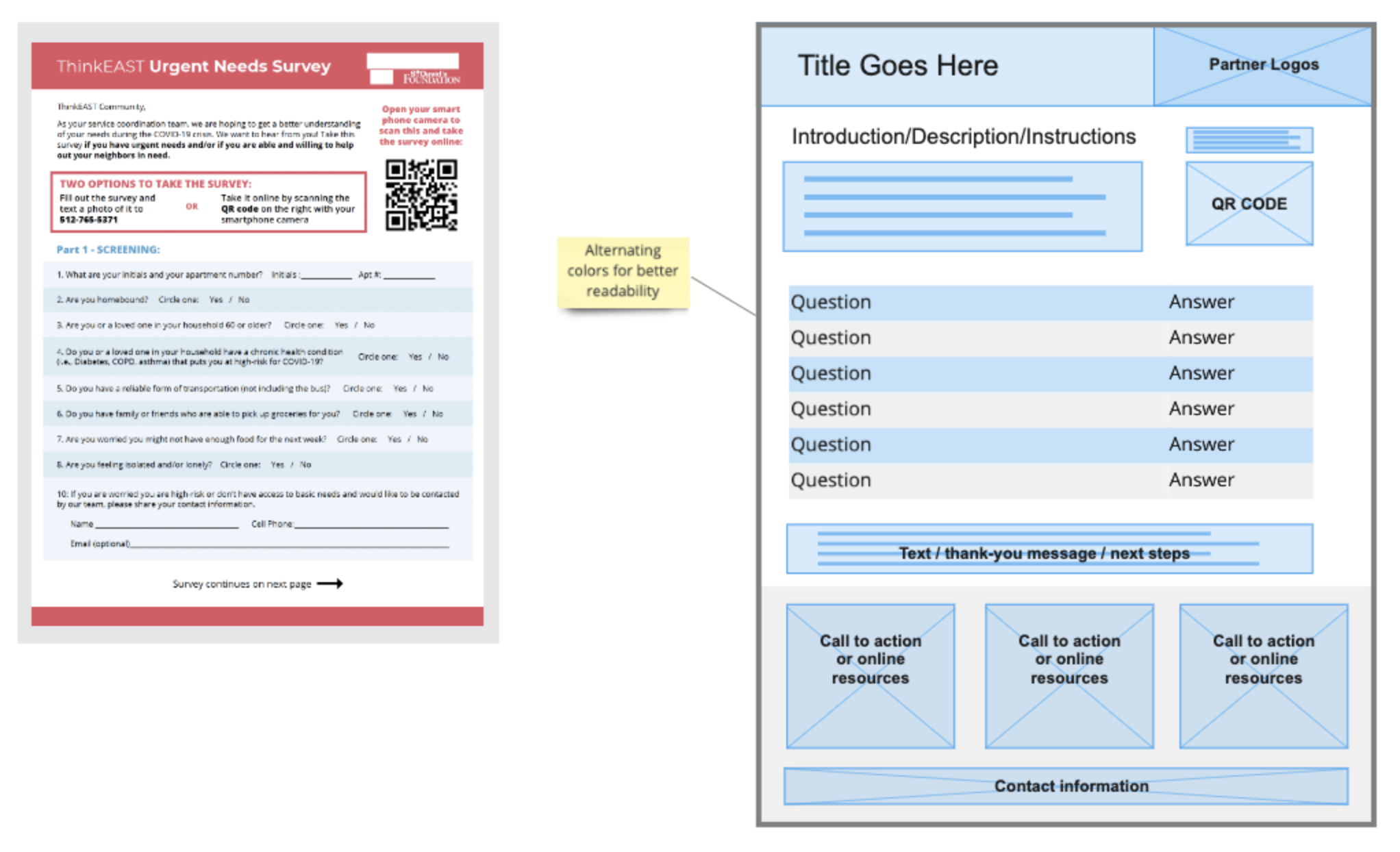
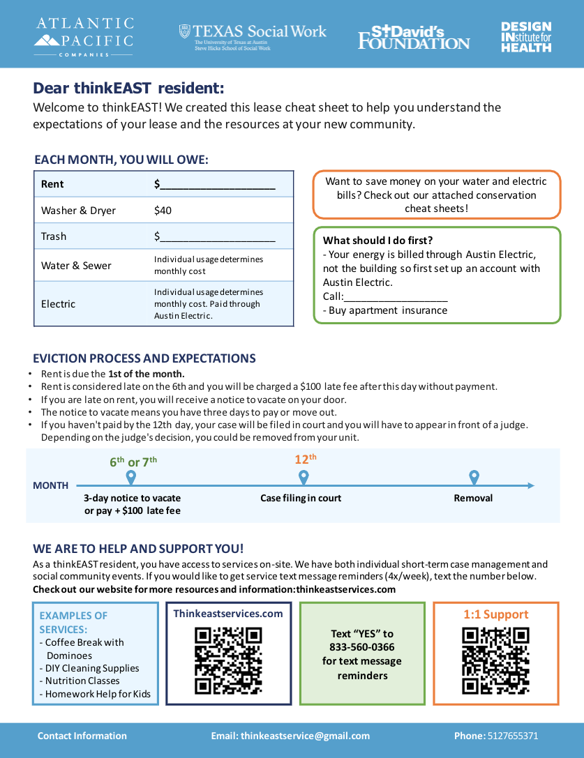
Visual Materials & Tools for Service Promotion
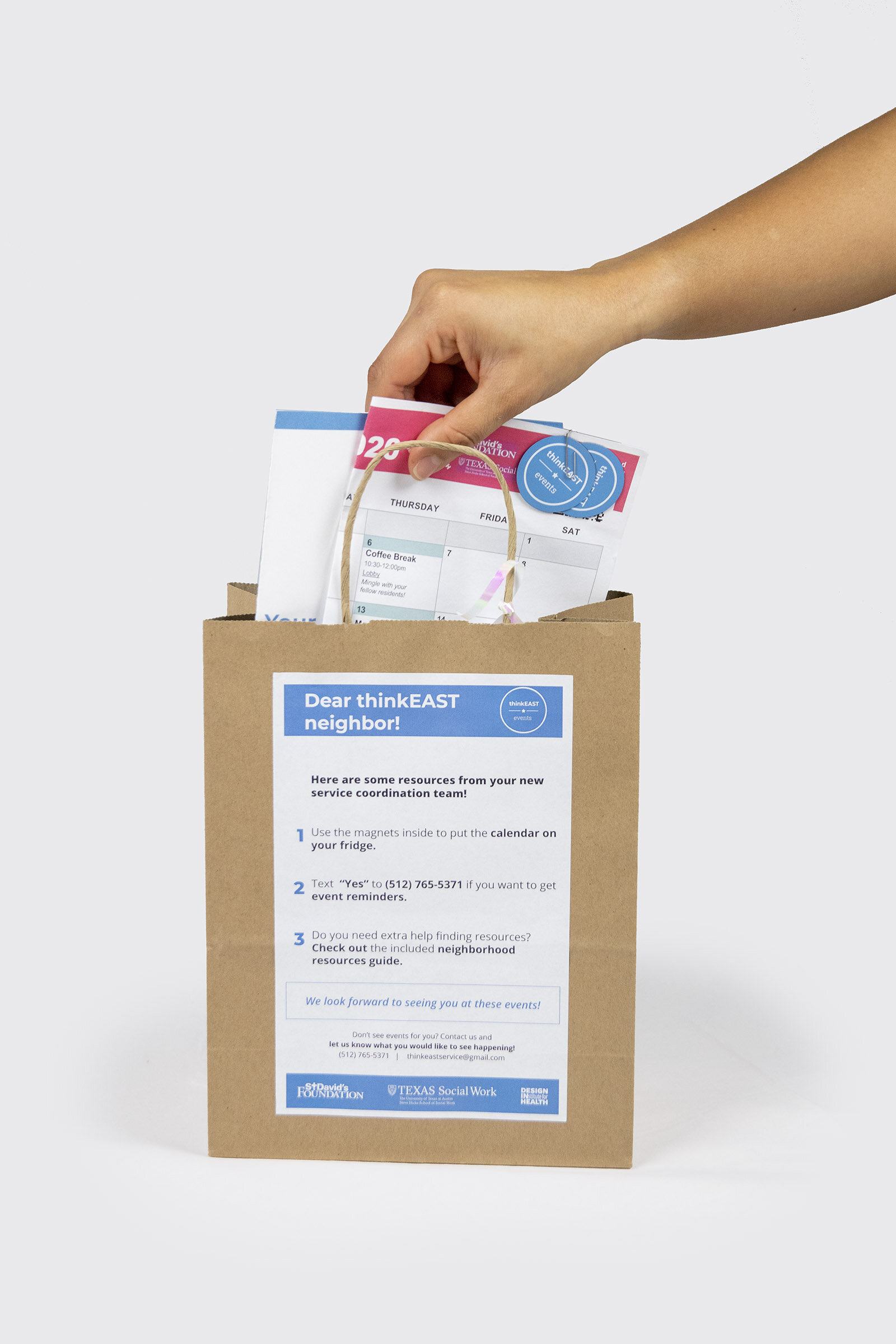
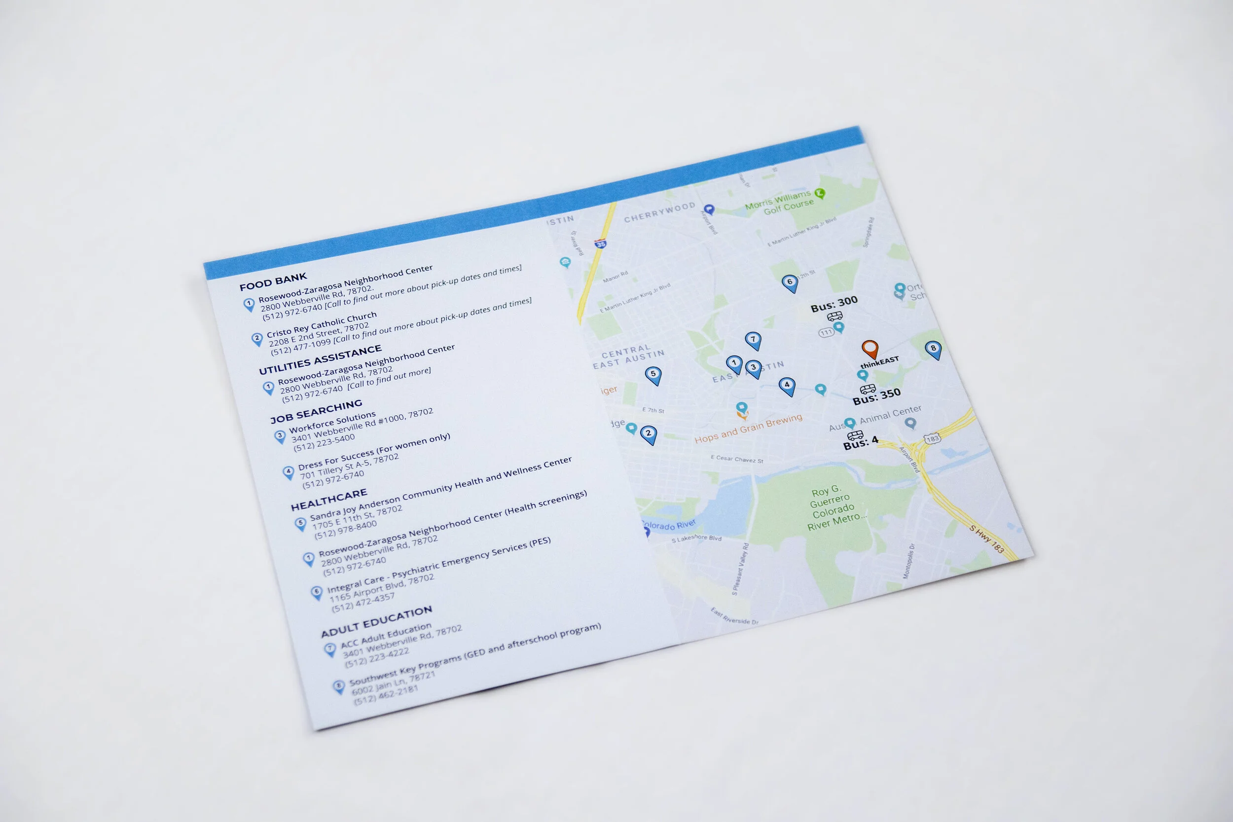
Welcome packages, resident surveys, information sheets, website (ex: updating residents on their rights surrounding eviction), calendars, etc.
Digital mockups courtesy of Caroline Garry via the Design In Health Case Study page for this project.
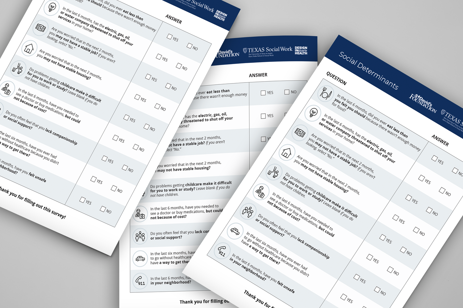
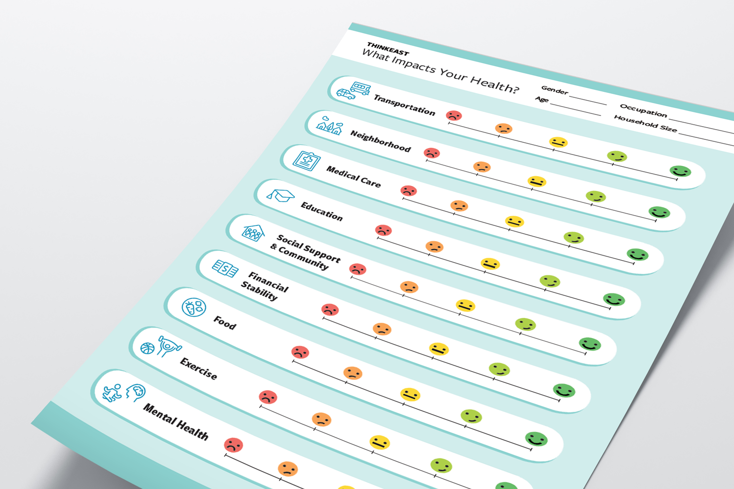
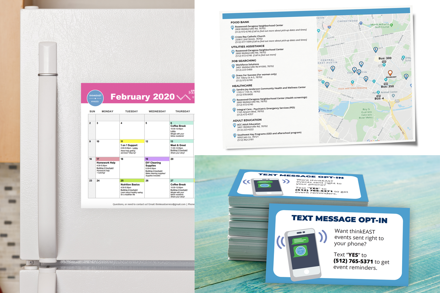
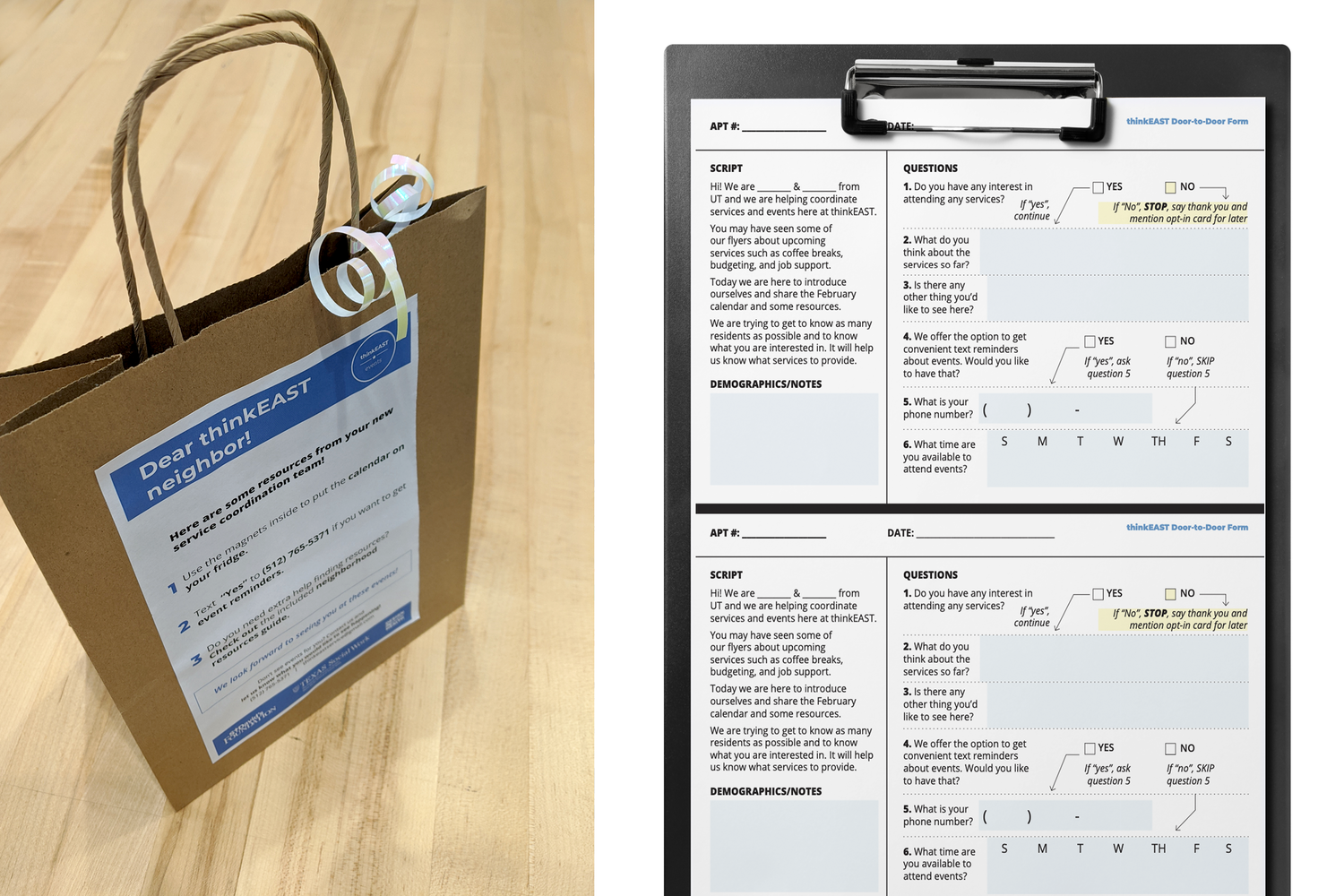
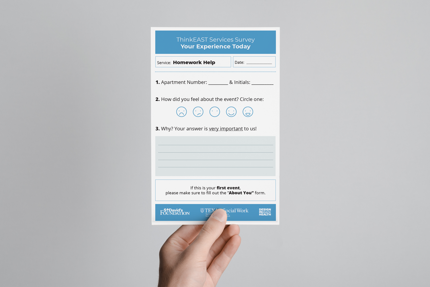
Credit: Diana Gonzales
ThinkEAST Services Website
Unfortunately, this product wasn’t as successful as we’d hoped. For the community we were designing for, a technological solution wasn’t successful due to tech literacy, lack of internet access, cost of internet, etc. Creating the website to have all resources in one spot was a helpful prototype. Diana and I led content creation and IA, and the website was executed by Metinee Ding.
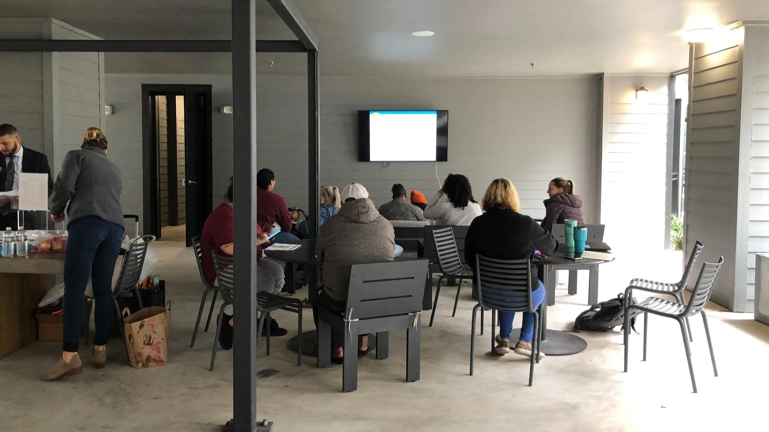
PHOTOS FROM synthesis, SERVICES, VISUAL MATERIALS, AND ADDRESSING COVID-19 NEEDS
Synthesis session
Budgeting 101 Service
Synthesis session
Assembling the COVID-19 packages for residents


