IDEO U: Service Design Course Project
Redesigning a coffee ordering experience
The course gave us a handful of options of project challenges, and I chose “Food and Beverage”. This area of focus was the most different from healthcare, where I work now. Specifically in Austin, there are plenty of new and unique coffee shops and restaurants that constantly open and close due to competition. I chose Cafe Medici, specifically one located in an apartment complex that had the lowest online reviews, meaning there was more opportunity for improvement.
PROJECT DETAILS
Date: Spring 2020
Prompt: Prompt listed here
Course Outcomes: From the IDEO U class page,
”Build differentiation, loyalty, and long-term business value by meeting your customers’ needs and exceeding their expectations.
Better understand the interactions people have with your company and surface problem areas and opportunities through a customer journey map.
Focus your efforts by choosing the most impactful moments to design.
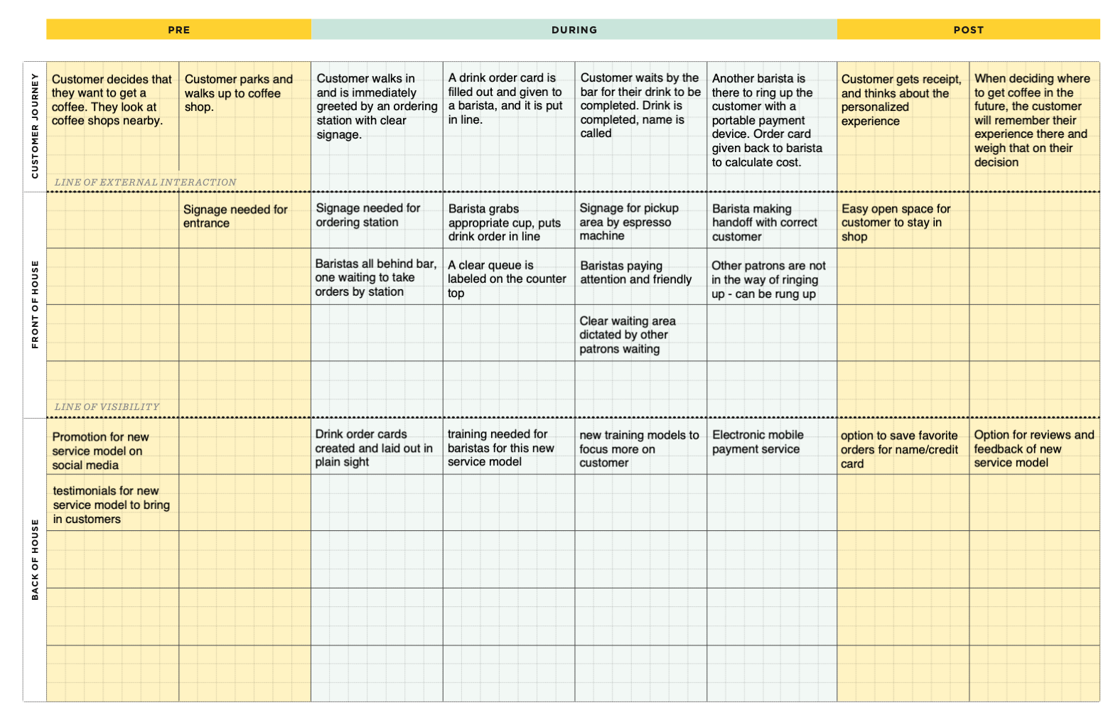
Enable others to understand and execute your vision with a service blueprint.”
Outcome: IDEO U reached out to have my project example be a part of future classes
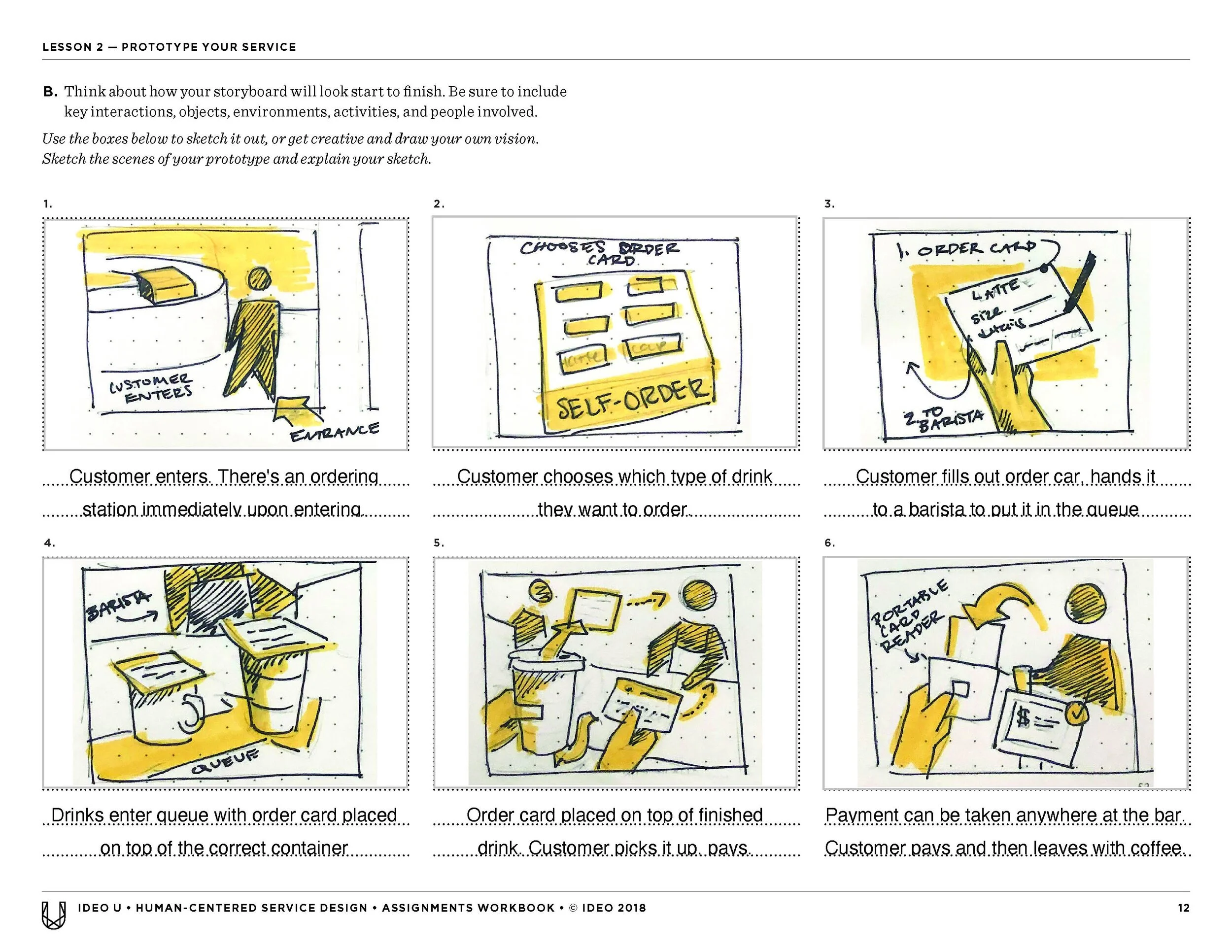
The course resulted in a certification and deliverables like a storyboard and a service blueprint, which can be seen below. After completion of the course, the instructors reached out to see if they could use my storyboard sketches and design solution in future courses as an example for other students.
Research
Primary research
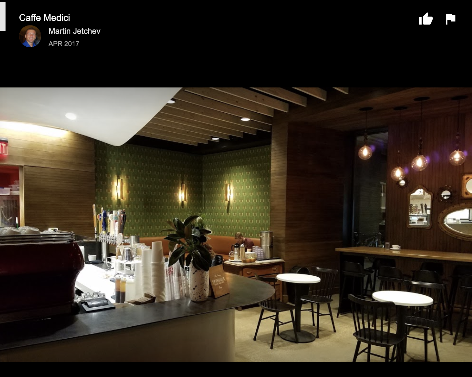
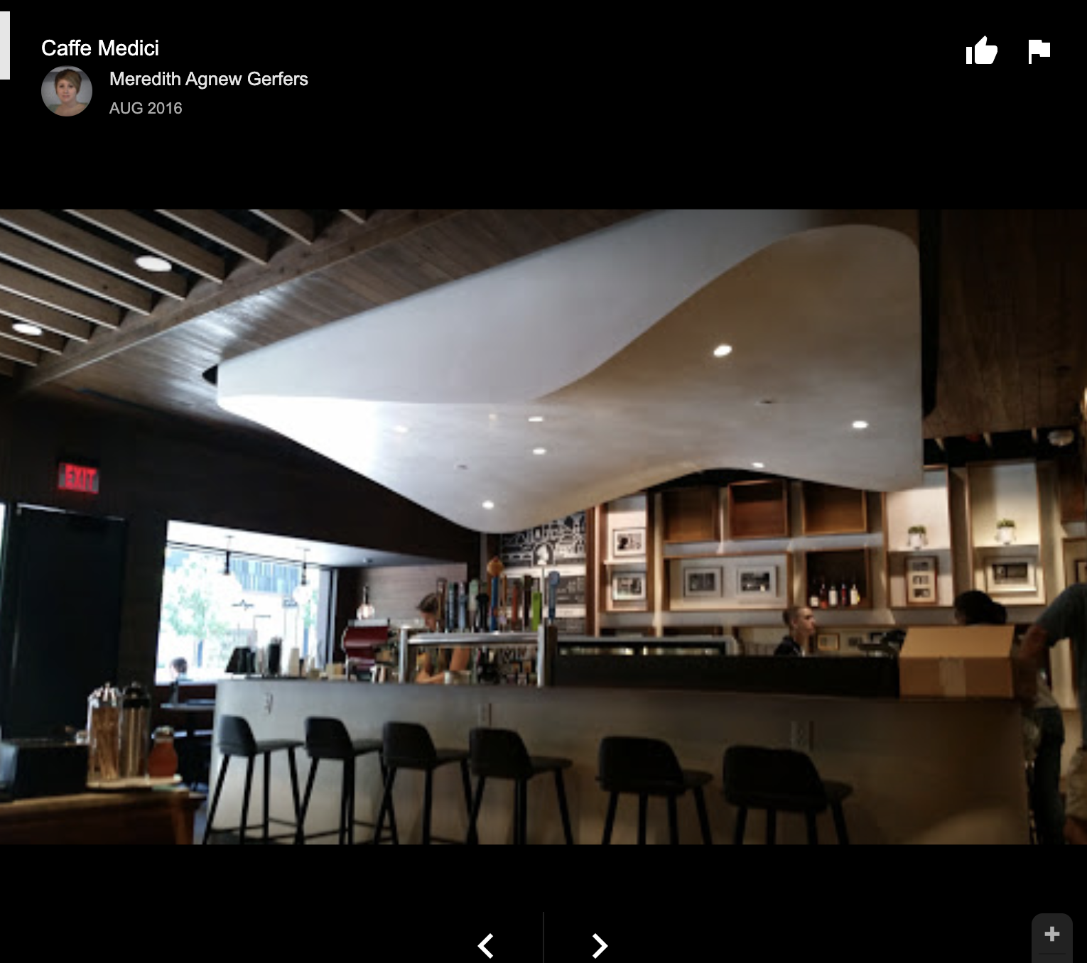
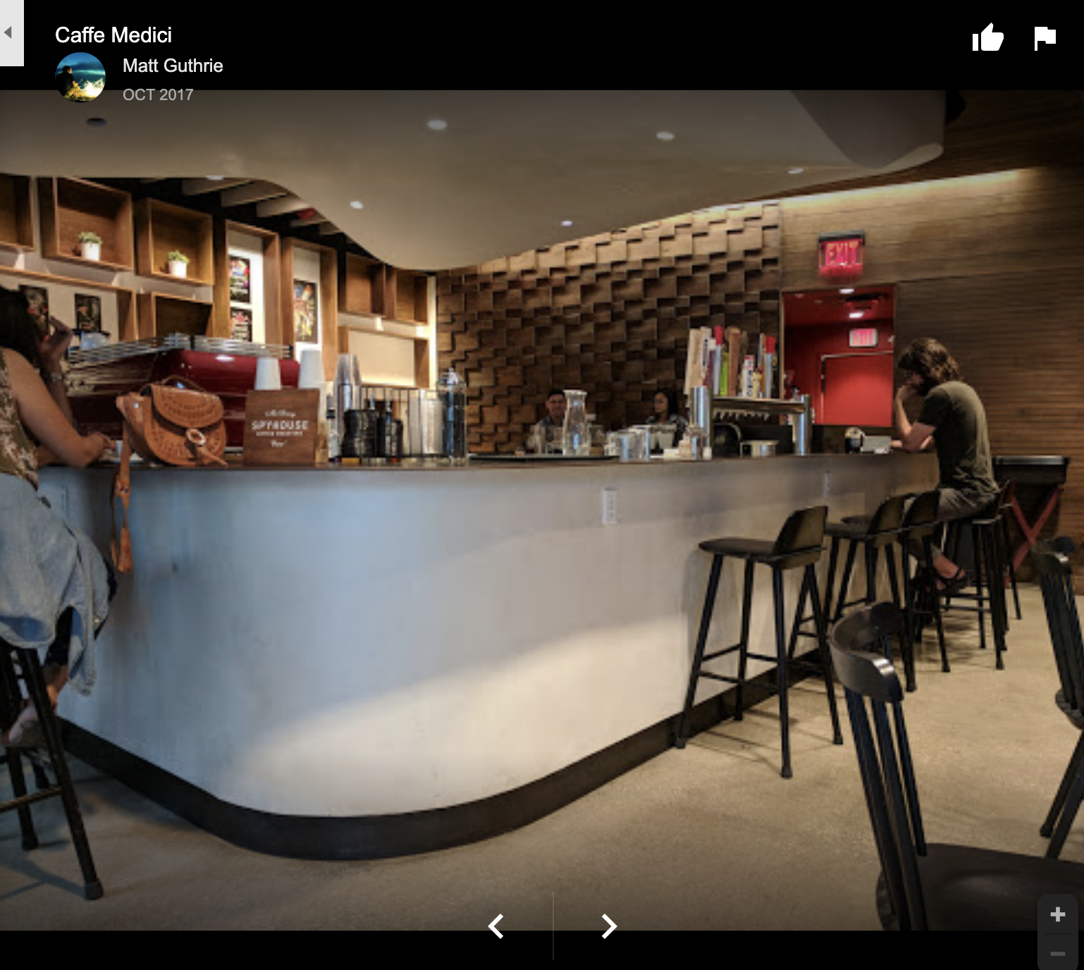
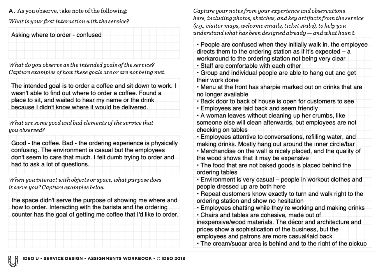
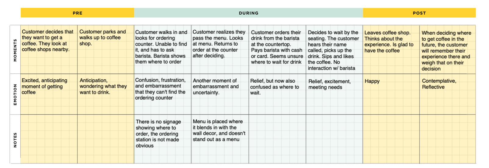
I observed customers come into the store. Some had never been to that coffee shop before, and they needed help asking for direction to where they could go to order. Something that really stood out was the fact that baristas would prompt them where to go before the customer had to ask — they created this prompt and had adapted to the poor layout of the store as a workaround.
COFFEE SHOP SCREEN SHOTS VIA GOOGLE
Process
INITIAL OBSERVATIONS
CUSTOMER JOURNEY & KEY MOMENTS
PROTOTYPING & FINAL SERVICE BLUEPRINT
My goal for the final prototype was not to go to a tech solution by default. I wanted to make the interactions feel more personalized for the customer, since the experience didn’t feel very joyful and was somewhat off-putting.


