Redesigning the Job Search Experience at Indeed
Self-led project during my Indeed Visual Design internship where I reimagined the job seeker experience by redesigning Indeed’s website. I was given a broad brief and the project occurred during an 8 week period, which included research and interviews, the design concept, and a presentation that I gave to the Creative Team and the UX team at Indeed.
Animations for the final concept were done by Nevena Peeva during her Graphic Design internship at Indeed.
PROJECT DETAILS
Date: 2016
Project Background: Summer project during my design internship at Indeed
Design: Product, Visual
Role: Individual
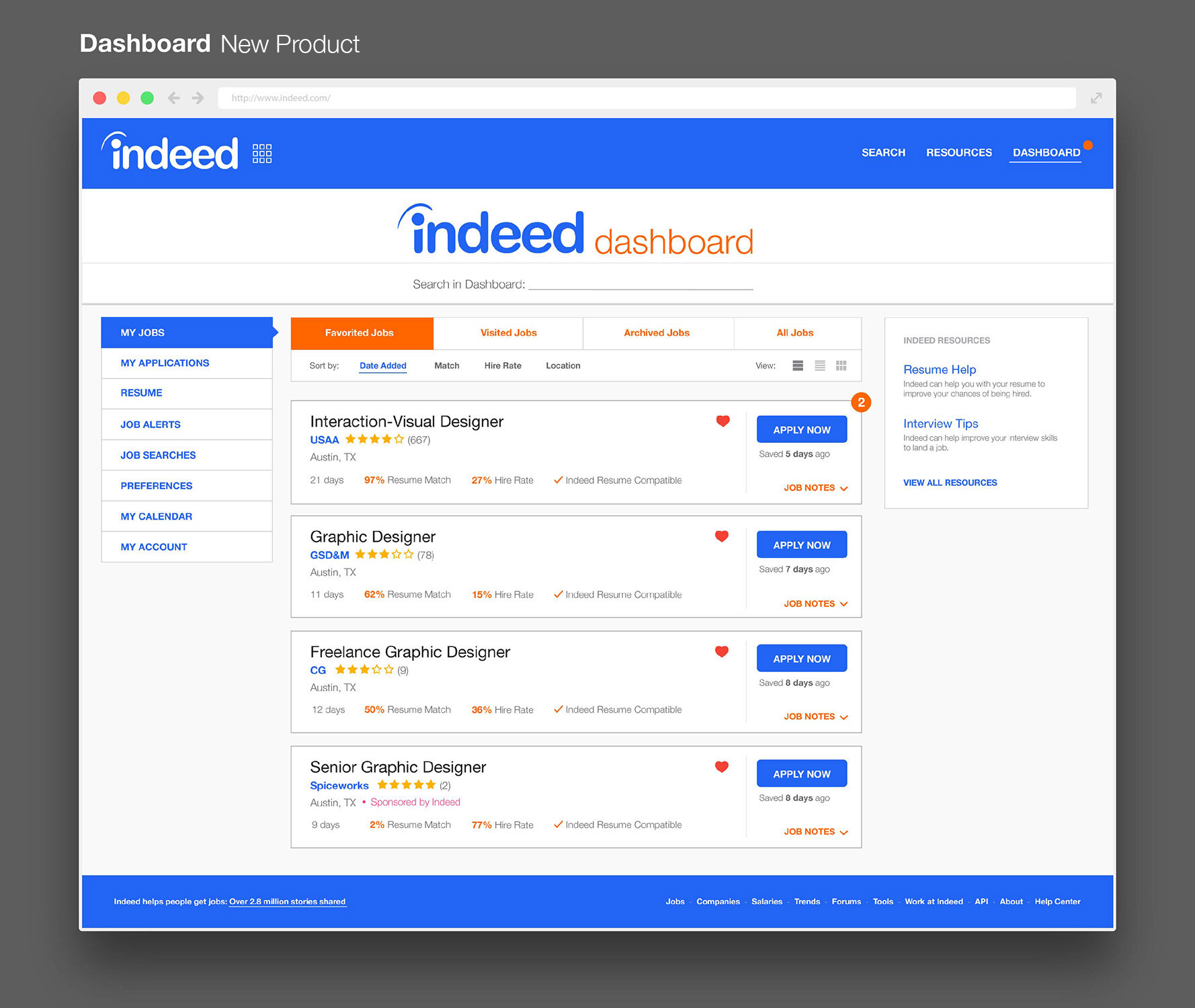
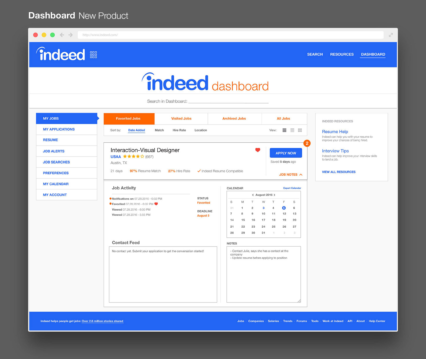
I collaborated with other members of the broader Indeed team to learn more about the needs of our jobseekers, which helped me design a better experience. The end product gave jobseekers more control, agency, and transparency during their job searches. I wanted to approach this project without current limitations to really create solutions that I felt fit the Job Seeker’s needs through this redesign.
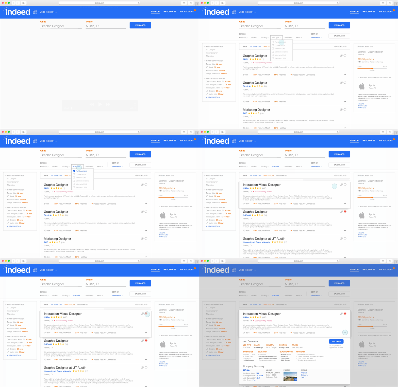
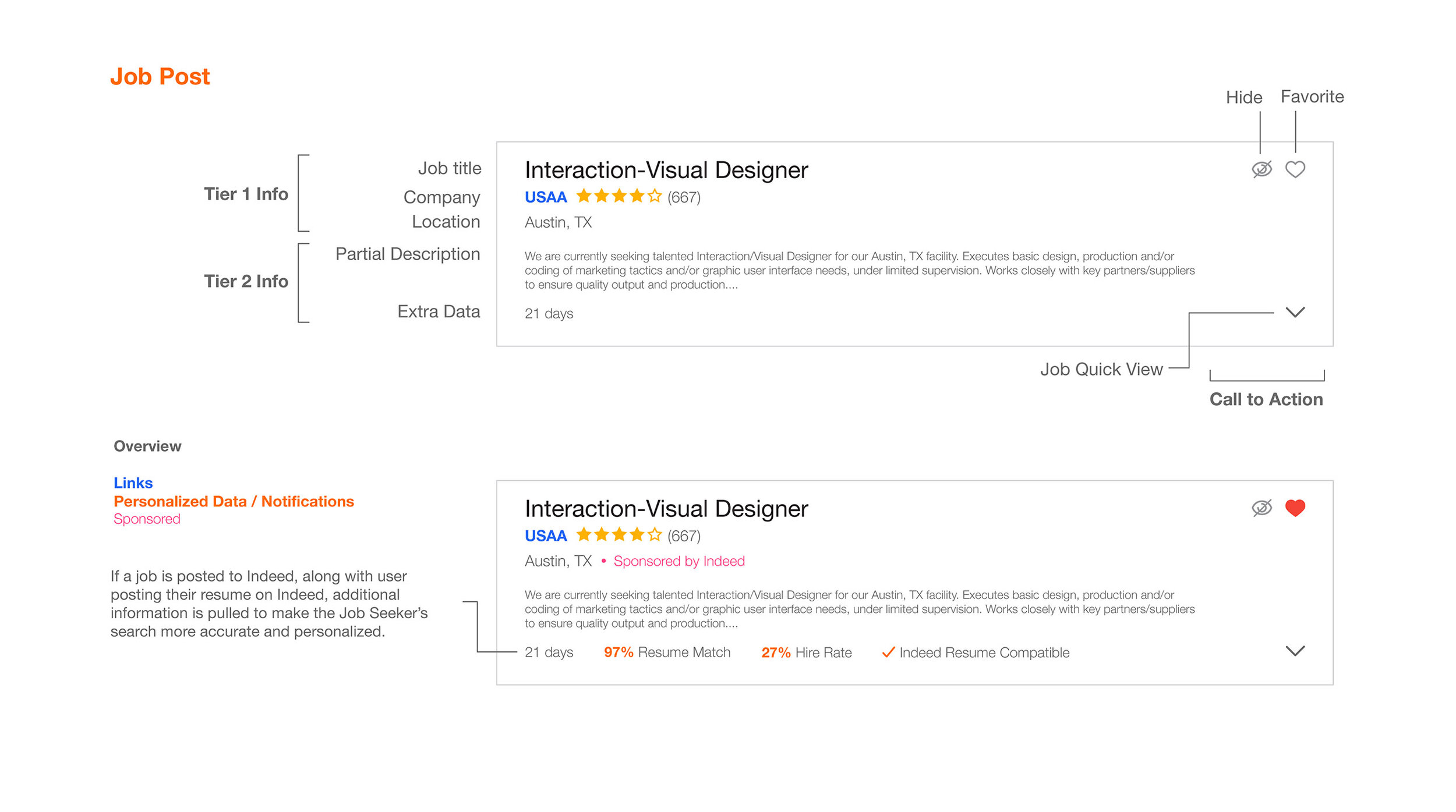
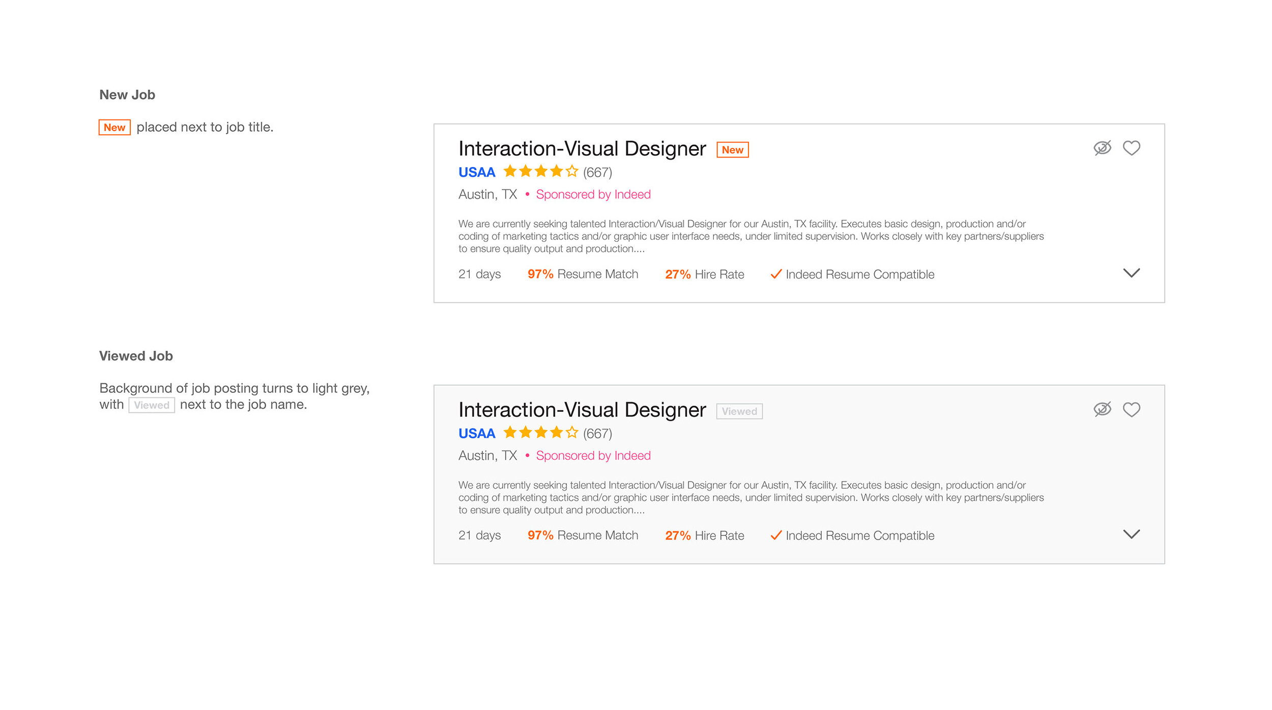
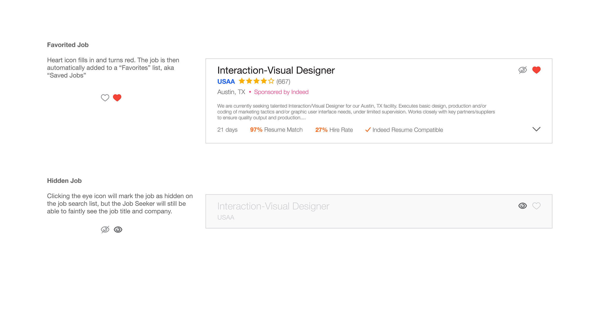
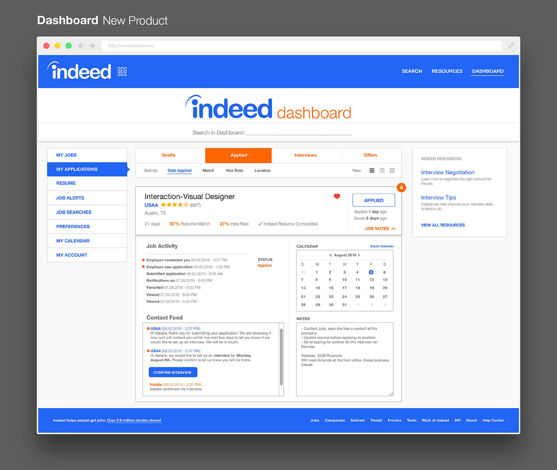
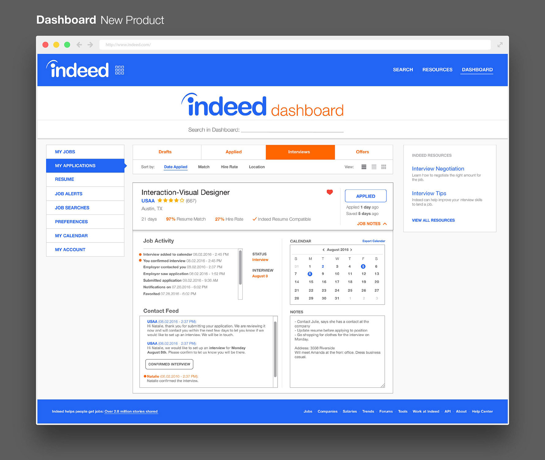
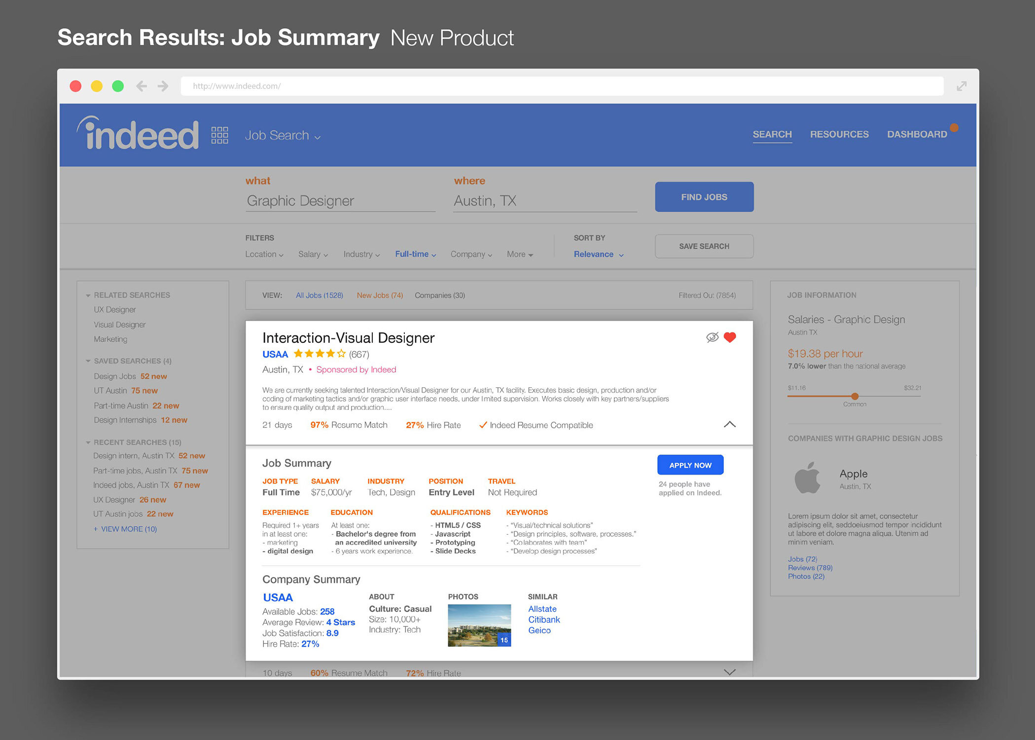
This involved creating new products for the site, including the Indeed Dashboard where users could manage their jobs and communicate with employers. I added Smart Resume where keywords and phrases from the user’s resume would overlap with job descriptions to better match users with job positions. I made the list of jobs into Responsive Jobs where users could act upon listed jobs, where they could read a Job Summary, hide a job, see more details, all while staying on the same search page and not having to open more tabs.
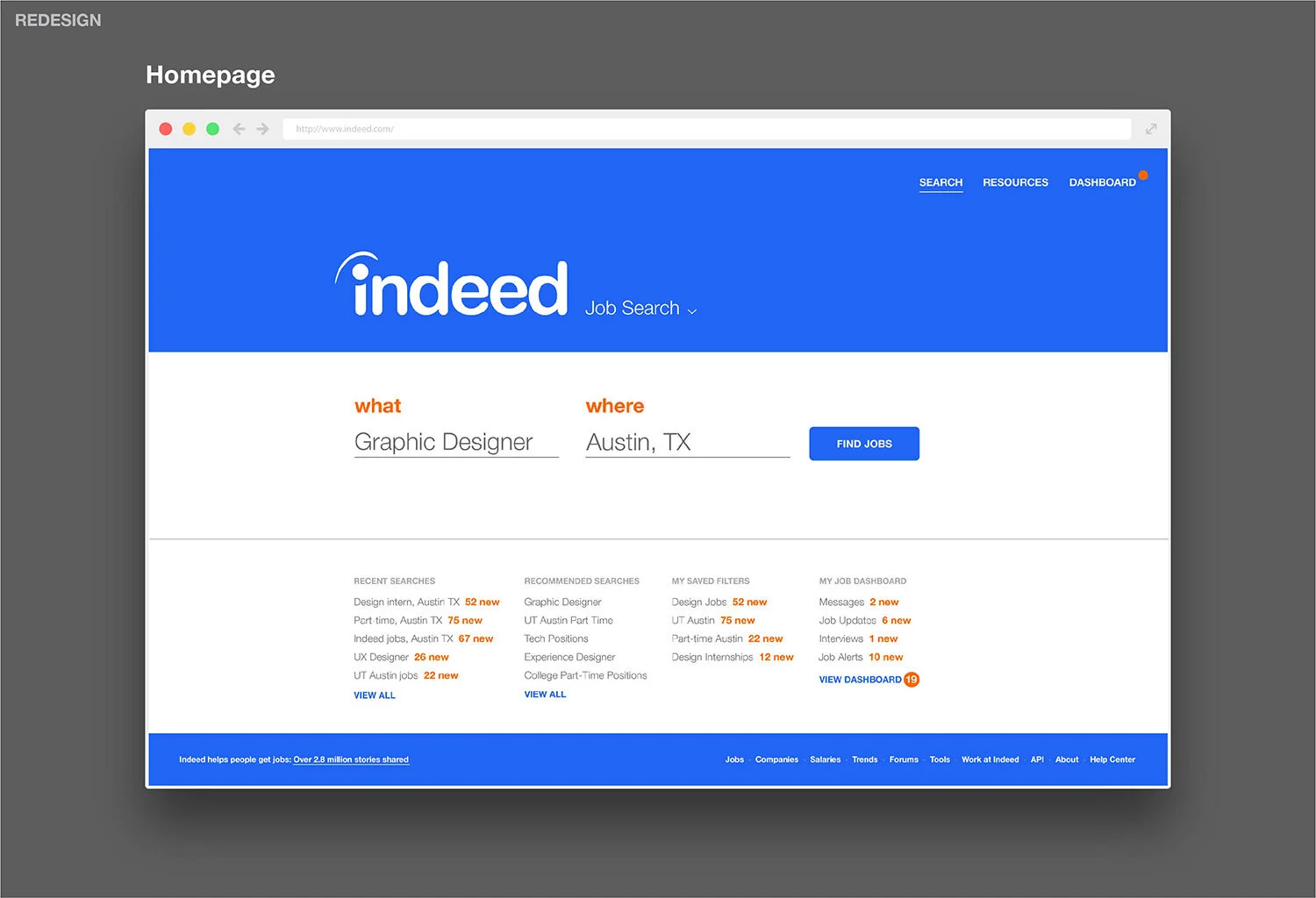
Redesign
UI ELEMENTS
New Product: Indeed Dashboard
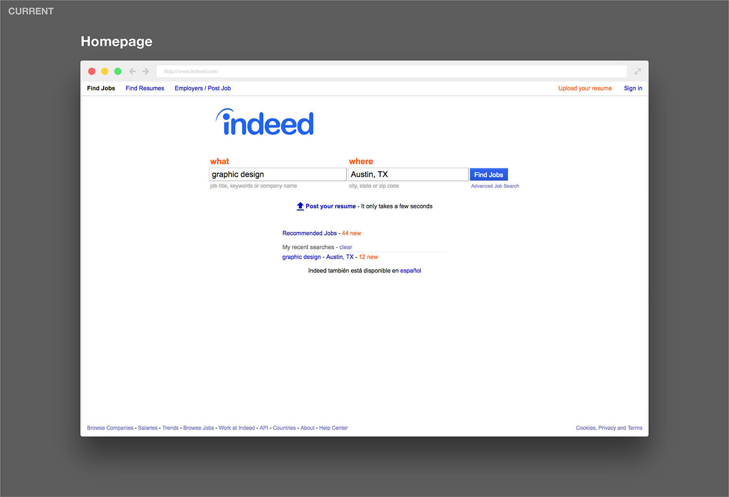
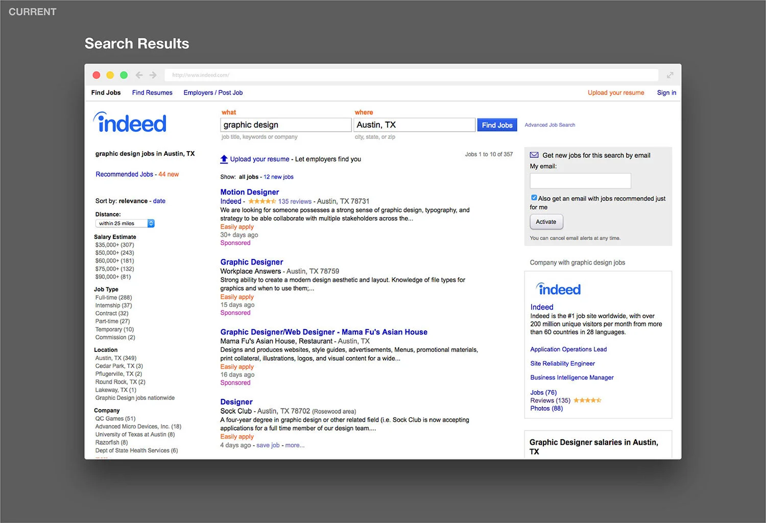
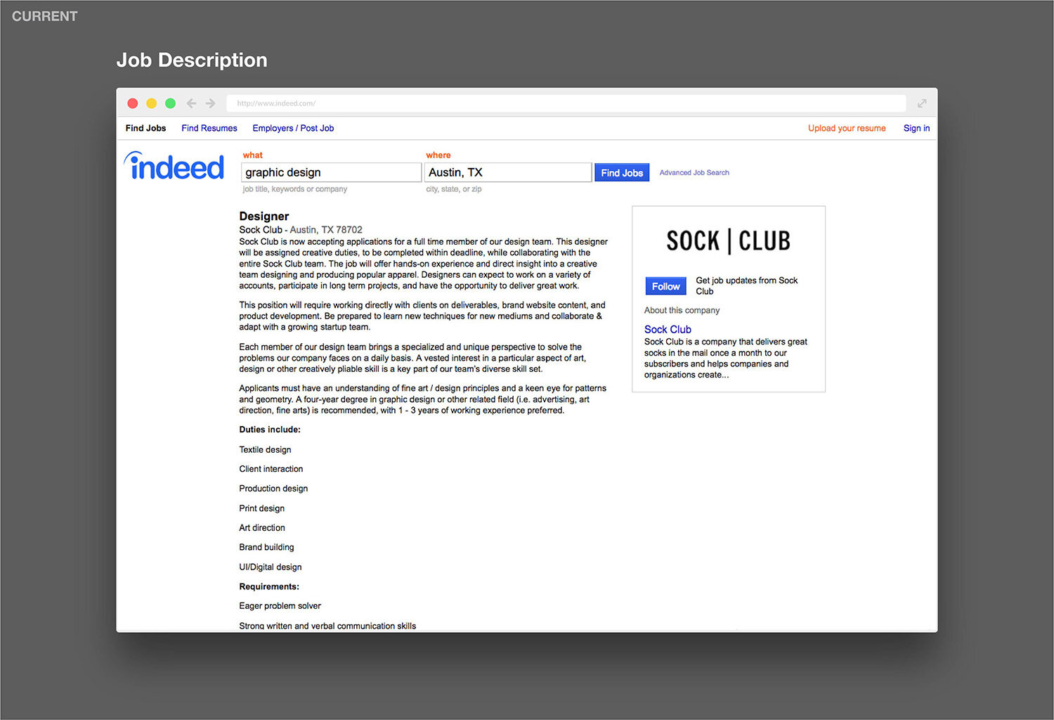
Current Site
Research
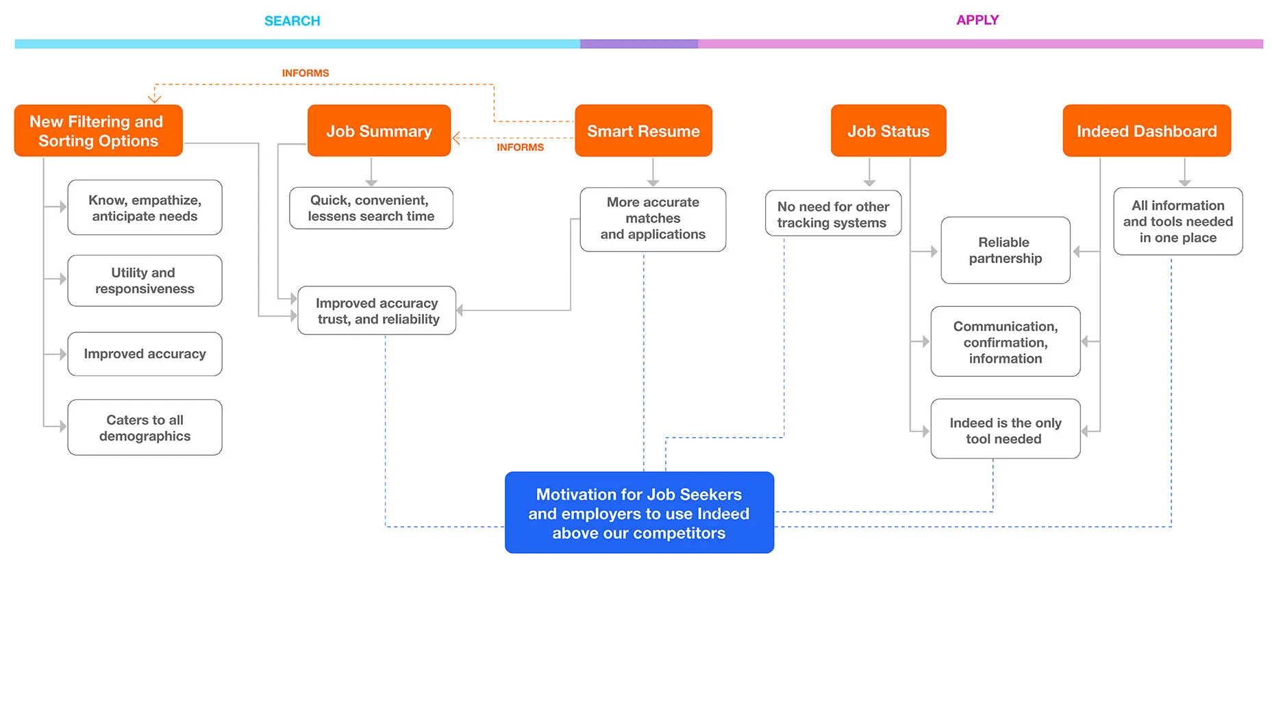
Research included looking at competition, data, and interviews. Research has been removed from the presentation and this page for company confidentiality. I had created a customer journey map, information architecture, product relationships and motivation, and a customer walkthrough.
Process
SKETCHES, USER FLOWS, WIREFRAMES, IA
Some process hidden for confidentiality reasons.

